本文最后更新于 2 年前,文中所描述的信息可能已发生改变。
TinyMCE三种模式
- 经典模式:基于iframe的沙箱模式,总是显示操作栏且拥有大量的操作按钮;样式上并非所见即所得(iframe的原因),更适合展示性要求不高的场景,比如表单项。
- 内联模式:基于普通块元素为容器(div),实现阅读视图和编辑视图的合并,所见及所得,不总是显示菜单栏;更适合展示性较强的场景,比如文章内容。
- 无干扰模式,似乎只是比内联模式少了菜单栏,使用上下文菜单,操作更加的轻巧(maybe)。
install & setup
npm i tinymce
以下基于经典模式实现封装
准备容器
- 准备一个textarea作为容器,绑定唯一实例id
- 加载
tinymce,必须在加载插件前调用!! - 加载插件,
./pluginLoader里面配置需要的插件列表 - 初始化函数
useHelp里面做具体的实例化操作和配置,以及封装
<template>
  <div
    class="jc-tinymce-container"
    :style="{ width: calcContentW }"
    v-loading="loading"
  >
    <textarea :id="tinymceId" ref="elRef"></textarea>
  </div>
</template>

<script lang="ts">
import tinymce from "tinymce";
import "./pluginLoader";
import { useHelp } from "./helper";
export default defineComponent({
  name: "JcEditor",
  setup() {
    const useHelpHook = useHelp(tinymce);
    return {
      ...useHelpHook,
    };
  },
});
</script>
在弹窗中使用时,编辑器的操作窗会出现层级不够的情况,导致被
element的弹窗所遮蔽。我们需要指定样式。
// 重置浮窗层级,确保比element高
.tox-tinymce-aux {
  z-index: 9999 !important;
}
插件列表(配置项)
//
export const plugins = [
  "advlist",
  "autolink",
  "lists",
  "link",
  "image",
  "charmap",
  "preview",
  "anchor",
  "searchreplace",
  "visualblocks",
  "code",
  "fullscreen",
  "insertdatetime",
  "media",
  "table",
  "codesample",
  // ...more
];
// 不常见工具
// const rareToolbar = 'subscript superscript code codesample anchor insertdatetime'
// | 分割 编辑器宽度不够时的可以缩略 以 ... 展示(mode:floating)
export const toolbar =
  "fontsize | styles | lineheight | searchreplace | bold | italic | underline | strikethrough | alignleft | aligncenter | alignright |outdent | indent | blockquote | undo | redo | removeformat | hr | bullist | numlist | link preview | pagebreak | forecolor | backcolor | table | jc-video | jc-image | fullscreen | codesample";
配置项
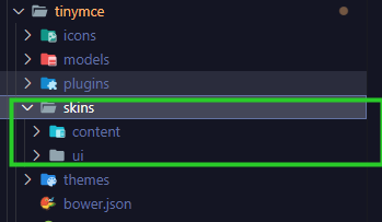
注意:在配置之前,需要将所需的资源文件导入到项目中,不支持从node-modules中 import。可以找到node-modules/tinymce中的资源文件,将其复制到public文件夹中。比如:node-modules/tinymce/skins。后续所有的配置都基于项目,package只提js的能力。TinyMCE 6.8.0之后似乎支持了直接导入和vite打包。
初始化配置目标:
- 配置主题
light/dark模式的切换,主题的配置包括skin和content,皮肤控制操作栏样式,内容控制编辑器内容样式。 - 配置语言
language,需要下载汉化包至public文件夹中,然后配置路径和语言名称。 - 配置编辑器
editor,编辑器配置包括toolbar和plugins。 - 配置使支持代码块,允许我们在展示模式下支持代码展示。
code:
const NS = "jc-tiny-edite";
// 动态创建主题皮肤
// 由于我们的主题切换时基于打包的,并不是运行时,所以可以通过获取环境变量的配置,动态获取主题
const { VITE_THEME } = import.meta.env;

// dark/light 皮肤名称
const skinName = VITE_THEME === "dark" ? "oxide-dark" : "oxide";
// 配置项
const initOptions = computed((): RawEditorOptions => {
  const { height, options, toolbar, plugins, readonly, disabled } =
    props as PropsType;

  // 如果指定readlony,则认定阅读模式,同时指定disabled和inline
  // 在展示性要求较高的场景下,例如展示性的文章等,可以使用readlony,使用行内模式+禁止编辑实现纯展示的效果
  const mergeOption = readonly
    ? Object.assign(options, { inline: true })
    : options;
  const mergeReadonly = readonly ? true : disabled ? true : false;
  return {
    selector: `#${unref(tinymceId)}`,
    height,
    toolbar, //工具栏
    inline: false, //行内模式,所见即所得
    menubar: false,
    plugins, //插件
    promotion: false,
    branding: false,
    convert_urls: false, //禁止转换url,否则打包构建后会出现路径混乱
    elementpath: false,
    codesample_global_prismjs: true, //允许自定义代码块样式
    toolbar_mode: "sliding", //工具栏使用浮动模式
    language_url: "/tinymce/editeLang/zh-Hans.js", //加载语言包
    language: "zh-Hans", //语言标识
    documentBaseUrl: "/",
    skin_url: `/tinymce/skins/ui/${skinName}`, //皮肤
    skin: skinName,

    // 加载iframe内容部分的样式
    // 接受一个路径数组
    // 由于iframe的样式隔离,系统的主体切换样式是无法干预的,所以需要手动指定内部的css路径
    // 而对于行内模式,编辑器是网页的一部分,风格应该和系统一致,所以inline模式下置空
    //也许你想要自定义部分样式,可以在此引入,比如这边的 jc.init.css ,这边我设置了和系统风格一致的滚动条样式,以及文字颜色,以寻求尽可能的样式统一(也可以配置在content_style中)
    content_css: [
      !isInlineMode.value
        ? `/tinymce/skins/content/${
            skinName === "oxide-dark" ? "dark" : "default"
          }/content.css`
        : "",
      !isInlineMode.value ? `/tinymce/skins/ui/${skinName}/jc.init.css` : "",
      "/tinymce/prism/dracula.css",
    ],
    // 这里可以配置一些自定义样式,例如上面的自定义样式也可配置在这
    // 可以是一个字符串,也可以是一个cssModule,这边我使用cssModule的形式,复写一些样式
    //内容将会加载在iframe头部的<styele></style>中
    content_style: resetStyle,
    // 代码块语言配置
    codesample_languages: [
      { text: "HTML/XML", value: "markup" },
      { text: "JavaScript", value: "javascript" },
      { text: "TypeScript", value: "typescript" },
      { text: "CSS", value: "css" },
      { text: "Java", value: "java" },
    ],
    object_resizing: true,
    font_size_input_default_unit: "px",
    font_size_formats: "12px 13px 14px 16px 18px 24px 36px 48px",
    images_upload_handler: (info, progress) =>
      imageHandle(info, progress, loading),
    file_picker_callback: (...args) => filePickCb(...args, loading),
    ...mergeOption,
    readonly: mergeReadonly,
    setup: optSetup,
  };
});以上主要注意:skin和content的区分,设置 convert_urls=false
文件上传
以上配置中我们自定义实现了 images_upload_handler和file_picker_callback方法。 images_upload_handler:复制粘贴行为触发的图片上传。将上传成功的url返回复显。 file_picker_callback:通过点击文件上传按钮(官方插件)触发上传,将上传成功的url返回复显。我们屏蔽了官方插件,不做介绍。
/**
 *图片上传
 * @param info 文件信息
 * @param progress 进度
 * @returns
 */
export const imageHandle = async (
  info: BlobInfo,
  progress: ProgressFn,
  loading: Ref<boolean>,
) => {
  try {
    // 获取文件流
    const rawFile = info.blob() as File;
    loading.value = true;
    // 自定义文件上传接口
    const res = await jcUploadFile(rawFile, UploadType.RICH_TEXT);
    return res.url;
  } catch (error) {
    console.error("jcUploadFile", error);
    return "";
  } finally {
    loading.value = false;
  }
};
自定义插件
官方或者社区的插件有时候并不满足场景的需求,所以我们需要自定义插件。 这边我们屏蔽了官方的文件上传按钮(操作步骤多一步弹窗选择),我们需要精简步骤,所以分别自定义一个文件上传和一个图片上传按钮。
- 需要在
toolbar中加上自定义插件名 - 在编辑器的
setup中注册插件。
code:
/**
 * 自定义视频上传插件(简化操作,自带的多一步弹窗)
 * @param editor
 * @param options
 */
export const usePluginVideo = (editor: Editor, options: PluginOpt) => {
  // 'jc-video'是 toolbar 中需要注册的按钮
  editor.ui.registry.addButton("jc-video", {
    // icon 使用官方的已有icon,自定义需添加注册
    icon: "embed",
    tooltip: "上传视频",
    enabled: true,
    onAction: (api) => {
      const input = useFileInput(acceptMap.media);
      input.onchange = async function () {
        try {
          const file = input.files![0];
          options.loading.value = true;
          const res = await jcUploadFile(file, UploadType.RICH_TEXT);
          // callback 回调的作用是将所选择的视频的url显示在输入框中
          //
          editor.insertContent(HtmlRenderer(MediaType.video, res.url));
        } catch (error) {
          console.error("usePluginVideo:jcUploadFile", error);
        } finally {
          options.loading.value = false;
        }
      };
    },
  });
};
// 图片上传和以上类似
配置项setup 注册插件
const optSetup = (editor: Editor) => {
  tinyInstance.value = editor;
  usePluginVideo(editor, { loading });
  usePluginImage(editor, { loading });
  // useTemplate(editor, { loading })
  editor.on("init", (e: any) => onLoaded(e));
};
辅助函数省略
useFileInput 辅助函数,根据类型创建 type=file 的input,(原生自定义文件上传按钮);
HtmlRenderer 辅助函数,根据类型创建 html 标签
useHelp 具体实现
export const useHelp = (tinymce: TinyMCE) => {
// 加载代码块语言
createSrc('/tinymce/prism/prism.js', 'jc-prism')
const loading = ref(false)
const { props, attrs, emit } = getCurrentInstance()!
const tinymceId = ref<string>(buildShortUUID(NS))
const fullscreen = ref(false)
// 编辑器实例
const tinyInstance = ref<Nullable<Editor>>(null)
// 内容区dom
const elRef = ref<Nullable<HTMLElement>>(null)
// 内容区宽度
const calcContentW = computed<string | number>(() => {
const width = props.width as number
return isNumber(width) ? `${width}px` : width
})
// 配置项setup
const optSetup = (editor: Editor) => {
tinyInstance.value = editor
usePluginVideo(editor, { loading })
usePluginImage(editor, { loading })
// useTemplate(editor, { loading })
editor.on('init', (e: any) => onLoaded(e))
}
// 配置项
const initOptions = computed((): RawEditorOptions => {
const { height, options, toolbar, plugins, readonly, disabled } = props as PropsType
//...
//...
// 返回配置项
return {...option}
})
// 是否行内模式
const isInlineMode = computed(() => initOptions.value.inline)
// 禁用
watch(
() => props.disabled,
() => {
const editor = unref(tinyInstance)
editor?.mode.set(props.disabled ? 'readonly' : 'design')
},
{
immediate: true
}
)
// 销毁编辑器
const destory = () => {
tinymce?.remove?.(unref(initOptions).selector!)
}
// 挂载
const mount = async () => {
tinymceId.value = buildShortUUID(NS)
await nextTick()
initEditor()
}
onMounted(() => mount())
onActivated(() => mount())
onBeforeUnmount(() => destory())
onDeactivated(() => destory())
// 初始化富文本
const initEditor = async () => {
destory()
try {
const opt = unref(initOptions)
const editor = await tinymce.init(opt)
emit('inited', editor)
} catch (error) {
emit('init-error', error)
}
}
// 设置富文本内容
const setValue = (editor: Editor, val: string, prevVal?: string) => {
if (editor &&
typeof val === 'string' &&
val !== prevVal &&
val !== editor.getContent({ format: attrs.outputFormat as 'html' | 'text' })
) {
editor.setContent(val)
}
}
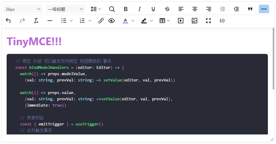
// 绑定 外部 可以触发双向绑定 视图更新的 事件
const bindModelHandlers = (editor: Editor) => {
watch(() => props.modelValue,
(val: string, prevVal: string) => setValue(editor, val, prevVal))
watch(() => props.value,
(val: string, prevVal: string) =>setValue(editor, val, prevVal),
{immediate: true})
// 表单校验
const { emitTrigger } = useTrigger()
// 合并触发事件
const evs = mergeEvents(attrs.modelEvents as string | string[])
editor.on(evs, () => {
const content = editor.getContent({ format: attrs.outputFormat as 'html' | 'text' })
emit('update:modelValue', content)
emit('change', content)
emitTrigger()
})
editor.on('FullscreenStateChanged', (e: any) => (fullscreen.value = e.state))
}
// 实力挂载完成后
const onLoaded = (e: Event) => {
const editor = unref(tinyInstance) as Editor
if (!editor) {
return
}
const value = (props.modelValue || '') as string
editor.setContent(value)
bindModelHandlers(editor)
bindHandlers(e, attrs, unref(tinyInstance))
}
return {
...
...
}
}使用自定义图标
增加 icon.js 文件,配置图标;
- 配置包名:
jc-icons - 增加图标:
template,使用 svg 代码
// icon.js
tinymce.IconManager.add('jc-icons', {
  icons: {
    template:
      '<svg ....></svg>'
  }
})
配置项
    icons_url: '/tinymce/icon.js', //扩展icon包
    icons: 'jc-icons', //扩展icon包里的包名
使用
  editor.ui.registry.addButton('jc-template', {
    icon: 'template',
    tooltip: '选择模板'
    ...
    })
自定义menu
结合element的组件,实现toolbar菜单
export const useTemplate = (editor: Editor, options: PluginOpt) => {
  editor.ui.registry.addButton('jc-template', {
    icon: 'template',
    tooltip: '选择模板',
    enabled: true,
    onAction: api => {},
    onSetup: () => {
      const tbtns = document.querySelector('.tox-editor-header')?.querySelectorAll('.tox-tbtn')
      const curBtn = Array.from(tbtns || []).find(i => i.ariaLabel === '选择模板')
      const vCom = h(
        'div',
        null,
        h(Poper, {
          reference: curBtn
        })
      )
      const container = document.createElement('div')
      render(vCom, container)
      document.body.appendChild(container.firstElementChild!)
      return () => render(null, container)
    }
  })
}